Pay Later In 30 Days & 3 Months Interest Free Or 12 Months With IwocaPay
Enjoy interest free payments for 30 days or 3 months, or spread the cost over 12 months on your Smart
Smart phones and mobile devices are starting to become a much more common way for people to access the internet, whether it is to check their email, look up information or read reviews and choose a restaurant to dine at in the evening. According to a study by statcounter 33% of web browsing takes place on a mobile device. If these trends continue in the same way, mobile devices will overshadow traditional PCs as the most common way of accessing the internet.
Research by Ipsos MediaCT has found that 46% of people use their smart phone or mobile device to find out about the best bars, restaurants and pubs in their area. This means that there is a very good chance that your customers are using their smartphone to find information about your restaurant while they are on the go. If you can capture the attention of these mobile users, it could result in more visitors to your restaurant.
However, you might be surprised to learn that in a poll of restaurant websites only 15% were designed with mobile devices in mind. That means that 85% of restaurant websites are not designed for mobile and might be slow to load, difficult to navigate and unattractive when viewed on a mobile phone.
If you own a restaurant, have you considered what your website looks like on a mobile? If visitors see your website on their smart phones, will they be able to find the information they need about your restaurant quickly and easily? Will they be enticed by clean navigation, attractive photos and a sleek design? Or, will they be turned off by a website that looks terrible on mobile?
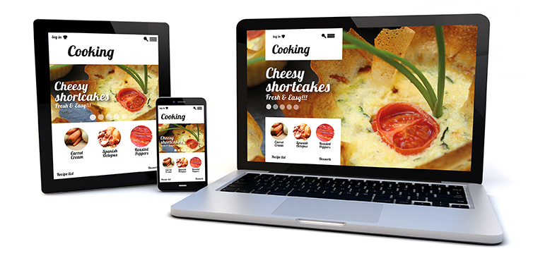
This type of website is one that is designed to look different when viewed on a web browser compared to viewing on a mobile phone. The website will be able to sense the size of the screen it is being viewed on and it will adjust its parameters to fit. The mobile version of the design will have many of the same elements of the full browser version, though they might be simplified and rearranged so that they are easier to view on a small screen. Also, the navigation system might also be different, so that it is easier to click on pages with a tap of the finger on a touch screen.
The responsive design will adjust to any screen size and resolution, which includes any new style of mobile devices that haven’t been released yet. It ensures that the important information and the most striking visuals are always displayed in the same way on every possible device, which makes it much easier for people to find what they are looking for when they click on your Mobile Responsive Restaurant Website.
Here are some of the major advantages to using a mobile responsive website:


These are just a few of the reasons why it is so important to have a mobile responsive website for your restaurant. To find out more, please feel free to Contact Us at any time.